
A loss tree is a diagnostic diagram that breaks total equipment time down into progressively specific causes. It starts from planned production time. It ends at the exact failure draining output. A loss tree turns a single OEE score into a map you can act on. It shows whether a plant is losing more to breakdowns, minor stops, or quality defects. It also shows which asset sits behind each branch. Maintenance teams use a loss tree to stop guessing at priorities. Instead, they fix the two or three causes responsible for most of the loss.
Key Takeaways

A loss tree is a hierarchical breakdown of equipment downtime and inefficiency. It starts at total available time. It branches down into specific, fixable causes. A loss tree is the visual form of OEE, the metric that measures true equipment output. Instead of reporting one number, the tree shows exactly where that number came from and why.
Most plants already track downtime. But they track it as a flat list of reason codes rather than a hierarchy. A loss tree fixes that. It groups every reason code under one of three OEE factors: availability, performance, or quality. Each factor then splits into its underlying losses. Those losses split again into the specific asset, part, or operator behind them.
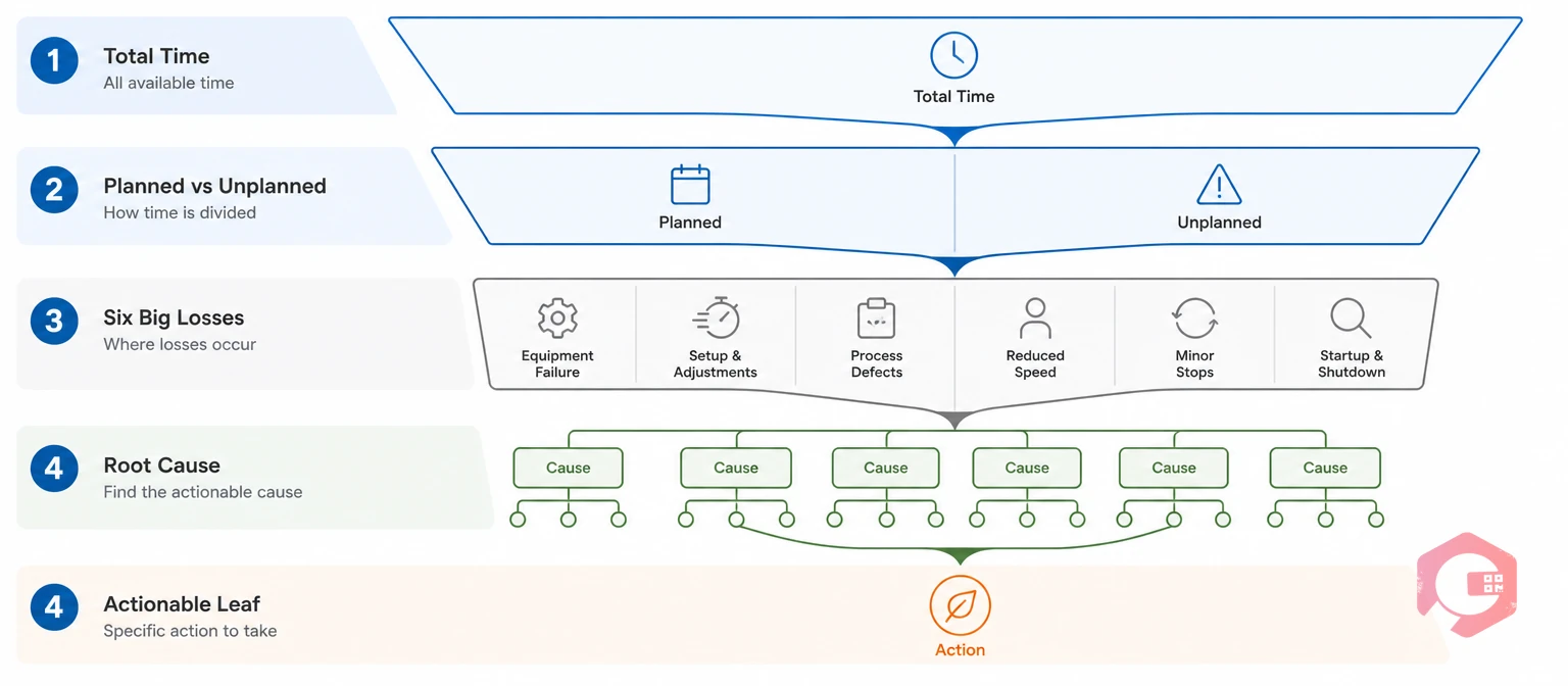
Every loss tree follows the same four-level structure. This holds true regardless of industry or equipment type. The table below shows what each level captures and the kind of root cause that surfaces at the bottom.
| Level | Branch | What It Captures | Typical Root Cause |
|---|---|---|---|
| 1. Total Time | Scheduled production time | The full window being measured — a shift, day, or month | — |
| 2. Planned vs. Unplanned | Scheduled stops vs. unscheduled stops | Separates PM and changeovers from breakdowns and stockouts | Shift change, scheduled PM vs. equipment failure |
| 3. Six Big Losses | Availability, performance, and quality losses | The OEE loss categories that every reason code rolls up into | Breakdown, minor stop, reduced speed, defect |
| 4. Root Cause | Asset, part, or process-level cause | The leaf-level detail a technician can actually act on | Bearing wear, missing spare part, calibration drift |
The deeper the tree goes, the more actionable it becomes. A category like "mechanical failure" tells you almost nothing on its own. "Bearing failure on the Line 3 conveyor" tells a technician exactly what to check first. Most teams find that stopping at level three feels complete, but it's level four that actually shortens repair time and prevents the same failure from repeating.

The Six Big Losses are the standard taxonomy for the third level of a loss tree. They were developed under Seiichi Nakajima's Total Productive Maintenance (TPM) methodology. Most reliability and OEE programs still use this model today. Availability loss is scheduled run time lost to stops, planned or unplanned.
Unplanned downtime carries a real cost. Industry estimates put the annual toll of unplanned manufacturing downtime at roughly $50 billion a year across the sector. Most maintenance teams find breakdowns and minor stops drive the majority of that figure. That only becomes visible once they build the tree instead of estimating from memory.
Want to see where your own plant's OEE loss falls across these six categories? Run the numbers with the OEE calculator before building out a full tree.

Building a usable loss tree is a data exercise before it's a visualization exercise. Skip the categorization step and the finished chart will be noisy. It will also read inconsistently between shifts.
A worked example makes this concrete. Say a packaging line runs at 71% OEE, meaning 29% of potential output is lost. Splitting that 29% might show 12% availability loss, 11% performance loss, and 6% quality loss. Availability loss of 12% might split into 8% unplanned stops and 4% planned stops. The 8% unplanned figure might then break down into filler jams, bottle misfeeds, and capper failures — with filler jams alone accounting for the largest single share.
Most facilities find that a handful of causes drive most of the total loss. The Pareto principle holds up consistently once downtime is broken down this granularly. Keep the tree to three or four levels. Going deeper than that usually produces categories too narrow to track consistently across shifts.

A loss tree that lives only in a slide deck rarely changes anything. The value comes from what happens after someone sees which branch is heaviest. A work order is the record that turns a loss-tree finding into an assigned, trackable fix.
The Loss-to-Fix Loop:
Maintenance teams that close this loop every week see the compounding benefit, rather than reviewing loss trees once a quarter. Cryotos customers have reported up to 30% reduction in unplanned downtime and 25% faster repair turnaround once downtime data feeds directly into assigned work orders instead of sitting in a report nobody actioned.
A Computerized Maintenance Management System doesn't need a single widget labeled "loss tree" to support one. The tree is assembled from data that several connected modules already capture, rather than one purpose-built chart. The table below matches each layer to the module responsible for it, so teams know exactly where to look when a number needs explaining.
| Loss Tree Layer | Cryotos Module | How It Maps |
|---|---|---|
| Six Big Losses (raw data) | Downtime Tracking | Logs stops in real time by asset, department, or plant and calculates MTTR, MTBF, and breakdown hours automatically |
| Tree visualization | BI Dashboard & Reporting | Renders OEE, availability, and quality as drill-down views by plant, line, or asset — the closest built-in equivalent to a rendered tree |
| Root cause (leaves) | Work Orders (5 Whys) | Captures the exact leaf-level cause at the point of repair instead of reconstructing it later |
| Planned vs. unplanned split | Preventive Maintenance | Defines the planned baseline so anything outside schedule is automatically flagged unplanned |
The BI Dashboard is where most teams actually view the finished tree. It's already pulling from the same downtime and OEE data feeding every other layer described above.
A loss tree is easy to get wrong in ways that quietly undermine it. These mistakes show up across plants of every size. Watch for these patterns before trusting the output.
Most effective loss trees run three to four levels deep: total time, the Six Big Losses, a cause category, and a specific actionable item. Going deeper usually produces categories too narrow to track consistently, and shallower trees rarely point to a specific fix.
Not quite. An OEE dashboard typically shows the top-line percentage, while a loss tree is the drill-down structure behind that number showing exactly which losses make it up and by how much.
Review it monthly for tactical decisions about which improvement project to prioritize. Review it quarterly to check whether the loss categories themselves still make sense for your equipment and product mix.
Yes, but manual logging tends to miss minor stops that last only seconds. The performance-loss branch is usually the least reliable branch of the tree without some form of automated downtime capture.
A loss tree only earns its keep once it's routing straight into corrective action instead of sitting in a report. Schedule a free demo to see how Cryotos turns downtime and OEE data into a loss tree that closes the loop with assigned work orders automatically.




Cryotos AI predicts failures, automates work orders, and simplifies maintenance—before problems slow you down.