Sticky filter dashboards are BI interface configurations that retain a user's filter settings, date ranges, and panel preferences between sessions — so a maintenance manager who filters by Plant 2, Shift B, and Rolling Equipment never has to reset those parameters every time they log in. In most CMMS BI tools today, that personalization simply does not exist. Filters reset. Dashboards default to organization-wide views. And maintenance professionals waste three to five minutes every single day rebuilding the same configuration they had yesterday.
This is not a minor inconvenience. When a reliability engineer, a shift supervisor, and a plant director all open the same dashboard and see the exact same generic view, the BI tool has failed three different users simultaneously. Personalization is the missing feature in CMMS BI tools — and the absence of sticky filters is where that failure shows up most clearly.
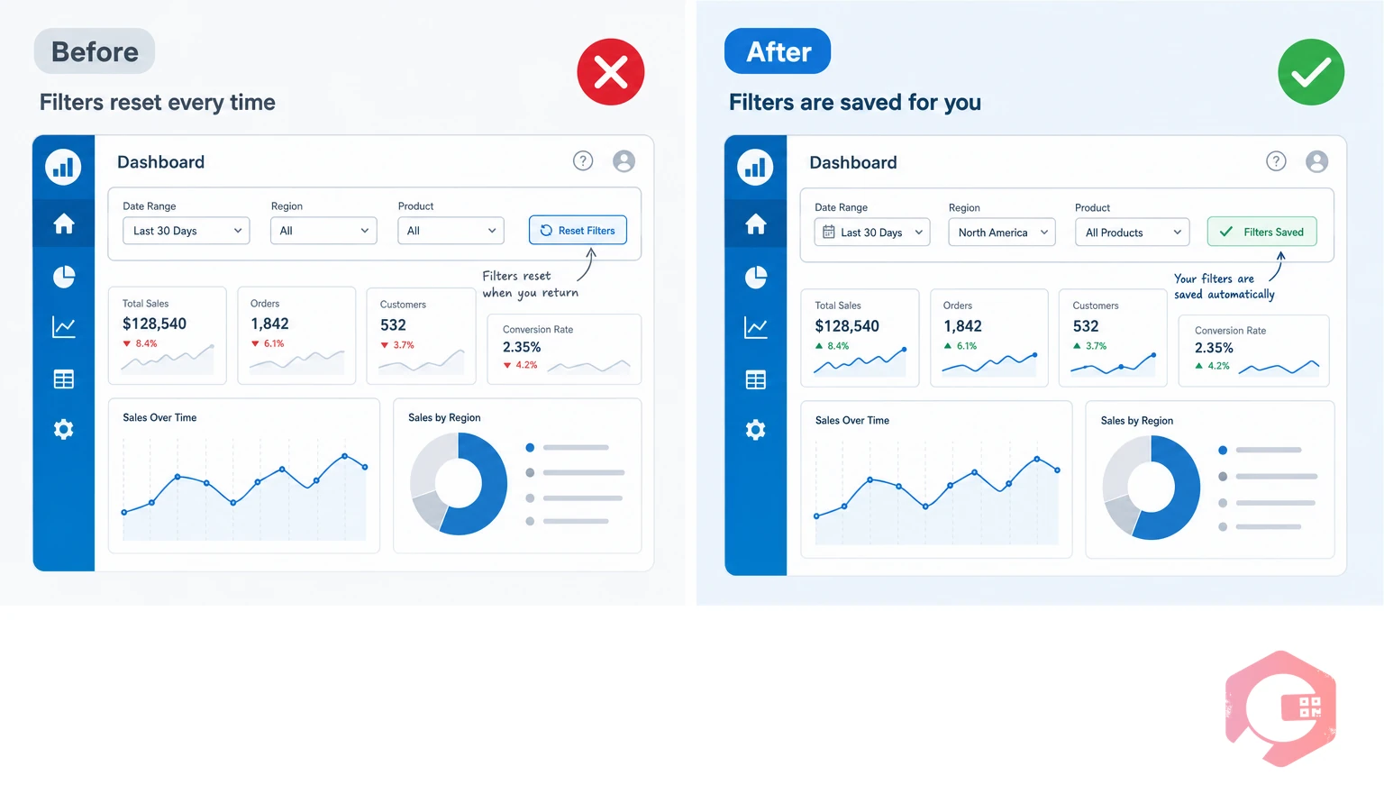
A sticky filter dashboard is a business intelligence interface that saves and persists a user's filter preferences across sessions. Unlike a standard dashboard that resets to default parameters on logout, a sticky dashboard remembers which sites, asset classes, departments, date ranges, and KPIs a specific user cares about — and loads those preferences automatically on every subsequent login.
The concept is straightforward. A shift supervisor for the night team at a food processing plant does not need to see aggregate uptime data across all three facilities. They need MTTR for their shift, open work orders assigned to their crew, and the downtime breakdown for their section. A sticky filter dashboard delivers that view without any manual configuration. The user's context is preserved.
According to a Gartner analysis of BI adoption in industrial operations, dashboard personalization ranks among the top three factors driving daily active use of analytics tools in maintenance and operations contexts. When users must rebuild their context each session, daily engagement drops sharply — and the investment in BI infrastructure goes largely unused.

Most CMMS vendors have invested heavily in building dashboards with impressive metric coverage. You can find OEE, MTTR, MTBF, PM compliance rates, asset availability, and downtime by category — all in a single interface. The data is there. The problem is how it is presented, and to whom.
The standard CMMS dashboard architecture assumes a single user type: the organization-level administrator who wants to see everything at once. The interface defaults to total organization data. Filters are available — but they apply only for the current session. Close the browser or log out on mobile, and the dashboard resets. Tomorrow morning, the maintenance supervisor starts over.
This creates a specific category of friction that BI researchers call "configuration tax" — the repeated effort users spend setting up their working environment before they can do the actual work they came to do. In a maintenance context, configuration tax is particularly damaging because the people paying it are often working under time pressure. A supervisor checking asset status before a shift briefing does not have four minutes to rebuild filters. They have thirty seconds.
The practical consequences show up in predictable ways:
The personalization gap in CMMS BI tools is not accidental. It is an architectural choice that made sense when dashboards were built for ERP-style reporting — quarterly reviews, monthly summaries, annual audits. In that context, everyone looking at the same organization-wide view was appropriate. Maintenance data was consumed by finance teams and plant directors, not by the operators and technicians who generated it.
That model has collapsed. Modern maintenance operations generate continuous data streams. IoT sensors, work order systems, downtime trackers, and inventory modules produce thousands of data points per shift. The people who need to act on that data in real time — reliability engineers, shift supervisors, facility managers — are not executives reviewing monthly reports. They are operational professionals who need a persistent, context-specific view of the data relevant to their role, their facility, and their current operational concern.
A 2024 study published in the Plant Engineering maintenance benchmarking survey found that facilities where maintenance staff reported high satisfaction with their BI tools were 2.3 times more likely to have role-specific dashboard configurations than facilities where staff reported frustration. The gap between data availability and data usability is where CMMS personalization fails.
Three specific gaps explain most of the frustration:

Maintenance organizations are not monolithic. A facility with fifty people involved in maintenance operations will typically have four or five distinct roles that consume BI data in fundamentally different ways. A sticky filter system that does not account for role differentiation is only partially solving the personalization problem.
Reliability engineers live in failure data. Their most important dashboard views are MTBF trends by asset class, failure mode frequency, repeat work order rates, and PM compliance by equipment family. They need the ability to filter by asset criticality tier and compare failure patterns across sites. The date range they care about is typically a rolling 90-day or 180-day window, not the default 30-day view that most dashboards load. A sticky filter for a reliability engineer locks in their criticality tier, asset family, and rolling window — so their failure analysis starts from a meaningful baseline rather than a generic summary.
Shift supervisors operate in real time. Their dashboard needs are narrower and more immediate: open work orders assigned to their crew, downtime events in the current shift, parts requests that are pending approval, and the PM schedule for the next twelve hours. The date range they care about is today. The site filter is always their facility. The department filter is always their section. A supervisor who has to navigate from an organization-wide view down to their specific context every time they open the dashboard will eventually stop opening it.
Plant directors need breadth, not depth. Their BI view is the opposite of the shift supervisor's — they want aggregate performance across all assets, all facilities, and all teams. But even at this level, personalization matters. A plant director who oversees three facilities and two product lines should be able to configure a persistent view that defaults to their portfolio without including sites managed by a different director.
Maintenance planners are the scheduling center of gravity for most maintenance operations. Their dashboard needs revolve around the PM schedule pipeline — upcoming tasks, technician availability, parts readiness, and backlog aging. They need filters that default to upcoming work orders in the 7, 14, and 30-day windows, with persistent views on their facility's specific asset registry.
Moving from the abstract to the concrete: what does a sticky filter dashboard actually change about day-to-day maintenance operations? Consider a reliability engineer at a food and beverage plant with three production lines and a rotating equipment fleet of 340 assets.
Without sticky filters, their morning routine looks like this: log in, see organization-wide data across all three lines, navigate to the filters panel, select Production Line 2, change the asset class to rotating equipment, set the date range to the last 90 days, collapse the work order panel, expand the MTBF trend chart, and then begin their actual analysis. That sequence takes three to five minutes and is repeated every single day — including on mobile when they are checking data from the plant floor.
With sticky filters, the same engineer logs in and sees exactly the view they left. Production Line 2 is pre-selected. Rotating equipment is the active asset class. The 90-day window is the default. The MTBF trend is expanded. They start their analysis immediately. The configuration tax has been eliminated.
Across a team of eight reliability engineers, each spending three minutes per day on dashboard reconfiguration, the total weekly configuration time is 120 minutes per week — time that could be spent on actual analysis, RCA documentation, or PM optimization. That is the operational cost of missing personalization, measured conservatively.
The practical implementation of sticky filters involves three layers:

If you are assessing your current CMMS BI dashboard for personalization capability — or evaluating a new platform — these are the specific questions that reveal whether sticky filter functionality is genuinely present or superficially claimed.
According to McKinsey's research on digital maintenance operations, organizations where maintenance staff can access role-relevant data within 60 seconds of opening their tools are significantly more likely to make data-driven decisions on the plant floor. The sixty-second threshold is the practical test: if your maintenance team cannot get to useful, specific, contextual data within one minute of opening the dashboard, the tool is failing them at the usage layer regardless of how rich its underlying data model is.
The Cryotos BI Dashboard is built around the recognition that maintenance operations involve multiple roles with fundamentally different data consumption needs. The platform's reporting and dashboard architecture reflects this through drill-down capability, role-based access controls, and a flexible panel structure that supports the kind of persistent, context-specific views that maintenance professionals actually need.
At the organizational level, Cryotos dashboards surface OEE, availability, quality, and performance metrics with drill-down access from the organization level all the way to the individual asset level. This layered structure means that a plant director reviewing aggregate performance and a reliability engineer investigating a specific rotating asset's MTBF trend are both working within the same system — but from views that are appropriate to their respective roles and operational contexts.
The Report Builder within Cryotos extends this with 50+ predefined reports and the ability to create custom reports with specific field selections, filters, and groupings. Reports can be scheduled for automatic daily or weekly delivery by email, which is one practical way maintenance teams address the reconfiguration problem — instead of rebuilding the dashboard every session, they receive the specific data they need in their inbox automatically.
For teams looking to strengthen their data-driven maintenance culture beyond dashboards, Cryotos's downtime tracking module ensures that every unplanned event is captured with cause codes, timestamps, and resolution records — giving the BI layer the complete, accurate data it needs to surface meaningful patterns rather than incomplete summaries.
The deeper personalization argument applies to the broader Cryotos system architecture: the work order management interface, mobile CMMS app, and notification system all support user-level role configuration — ensuring that what each person sees in their daily workflow is shaped by their role and responsibilities rather than a one-size-fits-all default.
If your maintenance organization is struggling with dashboard adoption — if team members are defaulting to verbal updates and manual exports because the BI tool does not remember who they are — the right response is not more training on the existing tool. It is a BI architecture review that starts with the question sticky filter capability is designed to answer: does this tool remember the context of each person who uses it, or does it ask them to rebuild that context from scratch every time they need data? Contact Cryotos to see how maintenance-specific BI personalization can work in your facility.
A sticky filter dashboard in CMMS is a BI interface that saves each user's filter settings, date ranges, panel configurations, and view preferences between sessions. When the user logs back in, their personal dashboard loads automatically with their saved context rather than resetting to organization-wide defaults. This eliminates the daily configuration effort that causes maintenance professionals to abandon BI tools in favor of informal communication channels.
Most CMMS BI tools were designed around a reporting model suited to executive reviews rather than operational daily use. The assumption was that dashboards would be opened periodically by senior staff who wanted aggregate data, not configured daily by shift supervisors, reliability engineers, and maintenance planners who each need a different operational view. As CMMS platforms have added more comprehensive BI capabilities, the underlying assumption has not always been updated to reflect the diversity of roles that now consume maintenance data in real time.
Conservatively, three to five minutes per session for each user who regularly consults the CMMS dashboard. For a maintenance team where eight professionals open the dashboard at least twice per day, that is 48 to 80 minutes of configuration time wasted daily — time spent rebuilding the same context that was present at the end of the previous session. Across a year, the aggregate cost in lost productivity is significant, and the secondary cost in reduced dashboard adoption compounds it further.
A saved view is a named configuration that a user can recall manually — it requires a deliberate action to load. A sticky filter is automatic — it loads without any user action because the system treats the user's last configuration as their default starting point. Both are valuable, but sticky filters reduce friction to zero because no action is required to restore context. Saved views still require the user to recognize that their context has been lost and actively recall a preset.
The practical test is to log out of the CMMS dashboard after applying a specific filter configuration, then log back in and check whether the filters are still active. If the dashboard resets to organization-wide defaults, sticky filter capability is absent regardless of what the vendor claims. Additional tests include checking whether preferences are user-specific rather than account-wide, and whether mobile app preferences sync with the desktop interface.


Cryotos AI predicts failures, automates work orders, and simplifies maintenance—before problems slow you down.