OEE for TPM programs works best when it is tracked live, not pieced together from shift-end spreadsheets. A BI dashboard pulls Availability, Performance, and Quality data straight from the plant floor. It turns that data into a shared score that operators and maintenance teams can act on right away. This matters because Total Productive Maintenance (TPM) is only as strong as the data behind it. Without solid OEE for TPM tracking, teams end up guessing instead of acting on real evidence.
Key Takeaways
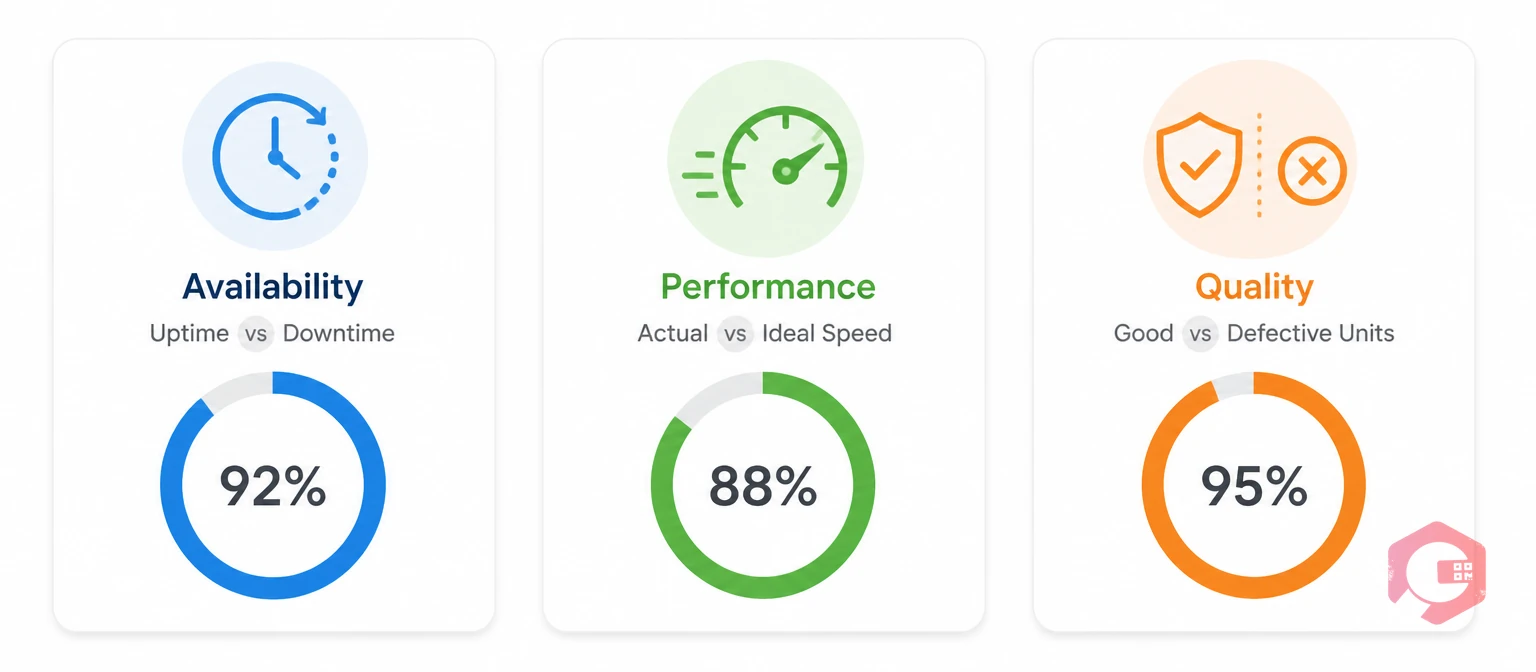
OEE is a score that shows how well a machine performs against its full potential. It combines Availability, Performance, and Quality into one percentage. That single number gives plant managers a quick read on uptime, speed, and output quality together.
Treating OEE for TPM programs as just one scorecard number misses the point. The real value comes from breaking that number apart. A team needs to see exactly where the loss is happening — a breakdown, a slow cycle, or a bad part — and route that insight to the right TPM pillar.
A single OEE percentage also tends to hide progress. A plant can improve Availability significantly while Quality quietly slips, and the blended score barely moves. That's why most mature TPM programs stop reporting OEE as one headline number internally and start reviewing all three components together at the same review cadence.
Groups like SMRP treat OEE as a core reliability benchmark. That's because it ties maintenance work directly to production output. Most facilities running OEE for TPM programs above 85% are considered world-class. The industry average usually sits in the 40–60% range, and that gap often points to unmanaged losses rather than worn-out equipment.
If your team is new to the metric, the full breakdown on Overall Equipment Effectiveness is a solid starting point. Standards bodies such as ISA also publish guidance on measuring plant performance, which many TPM teams use to set their own OEE targets.
OEE is calculated as Availability × Performance × Quality. Each part isolates a different failure mode on the plant floor.
A dashboard that only shows the final OEE percentage hides which of these three parts is dragging the score down. Most maintenance teams find that Availability losses dominate early in a TPM rollout. Performance and Quality losses tend to become more visible once breakdowns are under control.
For example, a line running at 90% Availability and 95% Quality can still post a disappointing OEE if Performance sits at 70% because operators are running well below rated speed to avoid jams. Without a component-level view, that line looks like a "downtime problem" when the real fix is a speed or setup adjustment.
Cryotos' Overall Equipment Effectiveness glossary entry walks through the formula step by step. It's a good shared reference for teams rolling out dashboard-based tracking for the first time.
Check where your own numbers stand with the free OEE calculator before deciding which component to tackle first.
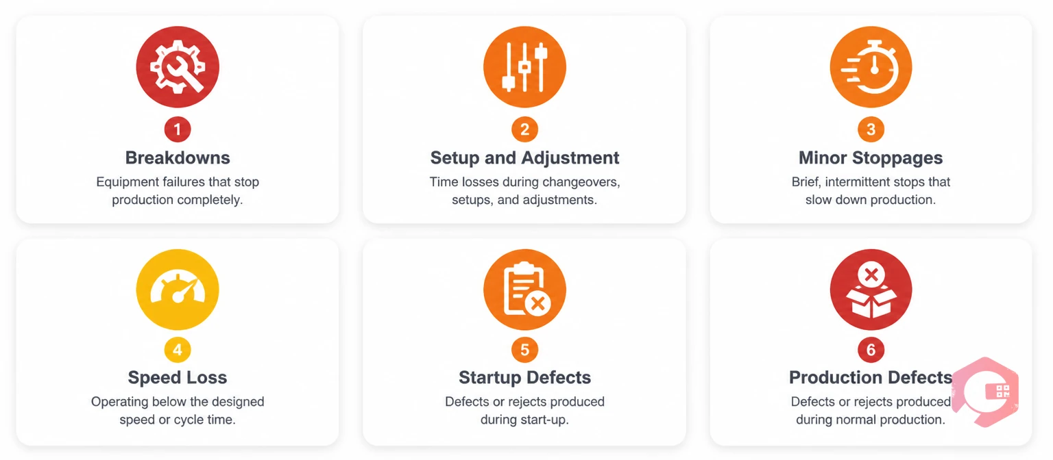
Manual OEE tracking — shift logs, whiteboards, end-of-day spreadsheet entry — causes two problems that quietly undermine a TPM program.
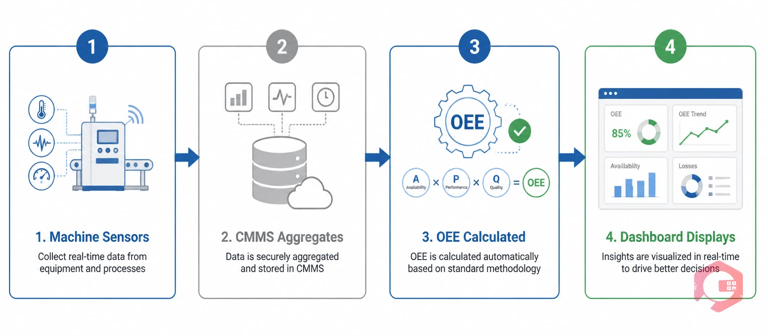
A Computerized Maintenance Management System that captures downtime and production data at the source removes both problems at once. The numbers feeding OEE for TPM tracking come straight from the equipment, not from someone's memory at the end of a long shift.
Most operations that successfully mature their TPM program make this switch early. Many only realize how bad the old data was after finding that a full quarter of "unplanned downtime" was actually miscategorized changeovers.
There's also a trust cost to manual tracking that's easy to underestimate. When operators know the OEE number comes from a spreadsheet someone fills in later, they treat it as an administrative task rather than a live signal worth reacting to. A dashboard changes that relationship, because the number on screen reflects what's happening on the line right now.
A BI dashboard is a live reporting screen that pulls maintenance and production data into one constantly updated view. It replaces the static end-of-shift report most plants still rely on.
Cryotos' BI Dashboard calculates OEE for TPM programs directly from logged downtime events, work order completions, and IoT or SCADA feeds where available. The Availability, Performance, and Quality breakdown updates as the shift progresses, not after it ends.
Maintenance teams using Cryotos have reported up to 30% reduction in unplanned downtime and 25% faster repair turnaround. Those gains trace directly back to catching losses while they're still happening, instead of reviewing them the next morning.
The dashboard can be filtered by asset, line, and shift. Plant managers can compare OEE for TPM programs across different production cells and spot which teams or machines need attention first, without waiting for a monthly report to surface the gap.
The Capture-Visualize-Diagnose-Act (CVDA) Loop:
This loop maps onto TPM's pillars in a direct way. Autonomous Maintenance depends on operators noticing early warning signs. A dashboard makes those signs visible instead of buried in a logbook somewhere. Planned Maintenance benefits when scheduling is guided by dashboard trends, such as MTTR and MTBF alongside OEE, rather than fixed calendar intervals alone. Quality Maintenance closes the loop by feeding defect data straight back into the Quality part of the score.
Cryotos' Report Builder extends this loop further. Teams can schedule automated OEE summaries to plant managers and TPM coordinators without anyone manually compiling a spreadsheet each week.
Not every BI tool that displays OEE is actually built to support a TPM program. A few things separate a genuinely useful OEE for TPM dashboard from a generic analytics chart.
A dashboard missing even one of these tends to push teams back toward manual reconciliation. That reintroduces the lag and inconsistency problems a BI dashboard is supposed to solve in the first place.
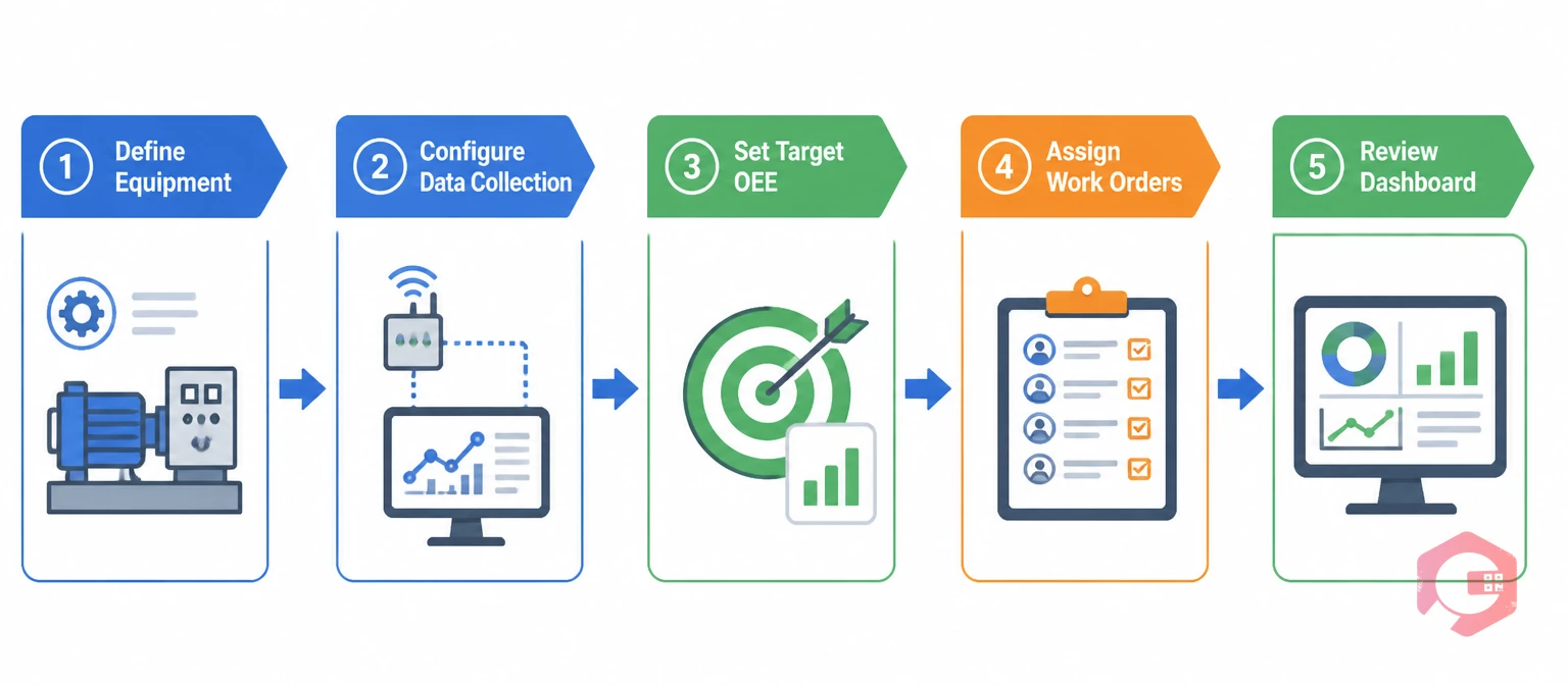
Most facilities don't need to overhaul their entire maintenance process to start tracking OEE for TPM programs properly. A phased rollout tends to work better than a single big switch.
Teams that start small and expand tend to trust the OEE for TPM numbers more, because they've watched the data get cleaner one step at a time. That trust is what turns a dashboard from a reporting tool into something the whole team actually checks before making a decision.
OEE is calculated as Availability × Performance × Quality, using data on planned production time, actual output, and good units produced. In a TPM program, this calculation usually runs continuously through a dashboard instead of by hand at shift end.
A score above 85% is generally seen as world-class, while most manufacturers run in the 40–60% range. The right target depends on your industry and equipment type, so it helps to benchmark against your own history first.
A BI dashboard pulls data automatically from downtime logs, work orders, and IoT feeds, and updates in real time. A spreadsheet relies on manual entry at the end of a shift. That gap directly affects how fast a TPM team can respond to a loss.
Yes. Most modern CMMS platforms, including Cryotos, support IoT and SCADA integration. Equipment data feeds directly into OEE calculations without manual logging.
Autonomous Maintenance and Planned Maintenance see the most direct benefit. Both depend on operators and technicians noticing performance trends early enough to act before a small issue turns into downtime. Quality Maintenance follows close behind once defect data starts flowing into the same view.
Many teams see cleaner Availability data within the first few weeks, since downtime logging is the easiest piece to automate. Full gains across all three OEE components usually build over two to three months as operators adjust their habits around the new data.
Tracking OEE for TPM programs by hand only gets harder as production scales. A connected dashboard keeps every shift working from the same live numbers. Schedule a free demo to see how Cryotos' BI dashboard can support your TPM rollout from day one.



Cryotos AI predicts failures, automates work orders, and simplifies maintenance—before problems slow you down.